


Color is the most powerful and most misused tool in mobile app design. It communicates faster than text, creates emotional associations stronger than images, and guides user attention more effectively than any layout trick. Yet most app color palettes are chosen based on brand guidelines and personal preference rather than on functional analysis of what colors need to accomplish within the interface.
The question should never be what colors do we like but what do we need colors to do. In a well-designed mobile app, color serves specific functions: establishing visual hierarchy, communicating state and feedback, creating brand recognition, and guiding users toward intended actions. Every color choice should trace back to one of these functions.
Hierarchy Through Color
Your primary action color, the one used for the main call-to-action buttons, should appear sparingly. When everything is colorful, nothing stands out. The most effective apps use a neutral palette for the majority of the interface and reserve their primary accent color exclusively for elements that invite interaction. This creates a clear visual hierarchy where the user’s eye is naturally drawn to the interactive elements without conscious effort.
Semantic colors communicate meaning that transcends language. Red for errors and destructive actions. Green for success and confirmation. Yellow or amber for warnings and attention. These associations are deeply established across cultures and platforms. Deviating from them, using red for a positive confirmation or green for a delete button, creates cognitive friction that slows users down and increases errors.
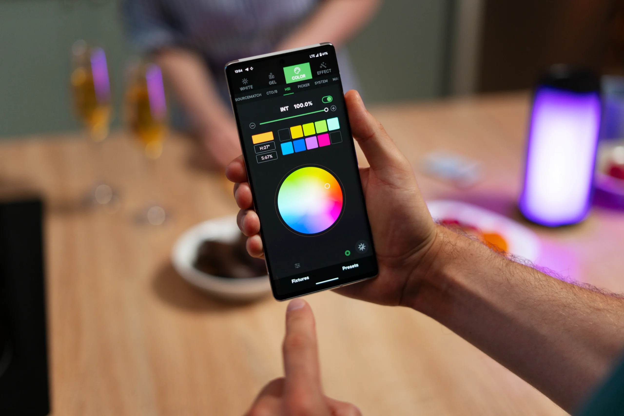
State Communication
Color changes are the fastest way to communicate element state. A button that shifts color when pressed confirms the tap registered. An input field that highlights red when validation fails tells the user where to focus attention. A navigation tab that changes color to indicate the current section eliminates the need for users to read labels to know where they are.
These state communications happen in milliseconds and process subconsciously. Users do not think about what the color means. They just know. This subconscious processing is what makes color such an effective design tool, and it is why getting color wrong creates vague feelings of confusion that users cannot articulate but that affect their behavior measurably.
Accessibility Cannot Be an Afterthought
Approximately eight percent of men and half a percent of women have some form of color vision deficiency. Designing an interface that relies solely on color to communicate critical information, like using only red and green to distinguish between error and success states without any other visual indicator, excludes a significant portion of your user base.
Always pair color with a secondary indicator: an icon, a text label, a pattern, or a shape change. This redundancy ensures that the information is accessible regardless of how the user perceives color, and it actually improves clarity for all users, not just those with color vision differences.
A design team that approaches color strategically creates interfaces where color works hard to improve usability rather than simply making the app look attractive. The visual appeal follows naturally when color serves function because purposeful design is inherently satisfying to interact with. For more on mobile app design best practices, visit our blog.
